Introduction:
Framing is a cornerstone of cinematography, shaping how audiences perceive and connect with visual stories. It’s more than just capturing what’s in front of the camera; it’s about thoughtfully arranging elements within the frame to guide the viewer’s eye, evoke emotions, and enhance the narrative. Whether you’re new to cinematography or looking to refine your skills, mastering framing is essential for creating compelling visuals.
This guide will explore the fundamentals of framing, different techniques, and how to apply them to elevate your cinematography, with references to iconic films like Blade Runner, Dune, and Alien, and the legendary cinematographers who crafted their visual style.
Film: Alien: Romulus
Director: Fede Alvarez
Cinematographer: Galo Olivares
Film: Ad Astra
Director: James Gray
Cinematographer: Hoyte van Hoytema
Film: The Exorcist
Director: William Friedkin
Cinematographer: Owen Roizman
Film: John Wick: Chapter 4
Director: Chad Stahelski
Cinematographer: Dan Laustsen
Cinematography has evolved dramatically since the early days of film, with pioneering cinematographers shaping the language of visual storytelling. Here’s a brief look at some of the key figures and milestones in the history of cinematography:
Georges Méliès: Often considered one of the first cinematographers, Méliès was a pioneer of early special effects and narrative film. His work in A Trip to the Moon (1902) introduced innovative techniques in framing and composition that influenced generations of filmmakers.
Sven Nykvist: Known for his work with director Ingmar Bergman, Nykvist is celebrated for his ability to use natural light and minimalist framing to convey deep emotional narratives, particularly in films like Cries and Whispers (1972) and Persona (1966).
Gregg Toland: Toland revolutionized cinematography with his deep focus technique in Citizen Kane (1941). His ability to keep multiple planes in sharp focus within a single frame allowed for complex compositions that added depth to the storytelling.
Roger Deakins: A modern master of cinematography, Deakins is renowned for his work on films like The Shawshank Redemption (1994), Blade Runner 2049 (2017), and 1917 (2019). His use of lighting, framing, and innovative techniques has earned him numerous accolades, including multiple Academy Awards.
Vittorio Storaro: Storaro’s work on films like Apocalypse Now (1979) and The Conformist (1970) showcases his mastery of color and light. His approach to framing often involves symbolic use of color and composition, adding layers of meaning to the visual narrative.
These cinematographers and their groundbreaking work have laid the foundation for modern cinematography, influencing countless filmmakers and defining the visual language of cinema.
And these are just a few of some the amazing cinematograhpers working and shaping the film industry today. Hoyte van Hoytema is another shining example of a modern cinematographer shaping the cinematic landscape for future filmmakers, his work on films such as Interstellar, Oppenheimer and Nope are just a few of the films he has shot that look absolutely amazing on screen.
Another amazing cinematographer we would like to mention is Dan Lausten who is best known for his work on the John Wick franchise of films, The Shape of Water, Crimson Peak and more. His work balancing lighting (covered in another article on our website) and capturing fast-paced action sequences while having a style that draws the viewer in is worthy of praise all on it’s own.
Framing in cinematography refers to how elements are positioned within the camera’s viewfinder. It involves decisions about what to include in the shot and how to place these elements to achieve a specific effect. Effective framing helps to:
The cinematographer holds a lot of power when it comes to how the visual narrative is translated on screen, not only are you in charge of making sure that you ‘get the shot’ but also how that shot looks and feels, being able to understand the basic building blocks of framing and learning how to work with and build off of those elements are key components in creating your own style and look when it comes to what you capture with your lenses. Ask yourself: What is the viewers attention supposed to be directed toward in this shot? How can DOF (Depth Of Field) affect or hinder what the director is trying to convey with the story? What can i do to make the shot convey the goal of the story while creating my own aesthetic appeal?
Sometimes it’s best to strip away everything to the basics and to build from there when framing your shot, take your time, plan your shots. Great execution relies on immaculate planning.
This is one of the most talked about topics in Film and Photography classes and schools all over the world. The Rule of Thirds is one of the most fundamental and widely used principles in framing. It’s a technique that involves dividing the frame into nine equal sections by drawing two equally spaced horizontal lines and two equally spaced vertical lines. The points where these lines intersect are known as “power points,” and placing key elements of the composition along these lines or at these intersections helps create balance, harmony, and visual interest.
Example: In Ridley Scott’s Blade Runner (1982), cinematographer Jordan Cronenweth often employs the Rule of Thirds, particularly in shots where Rick Deckard is placed off-center, drawing attention to the vast, dystopian landscapes that surround him. This technique not only enhances the visual composition but also reflects the character’s isolation within a sprawling, impersonal world.
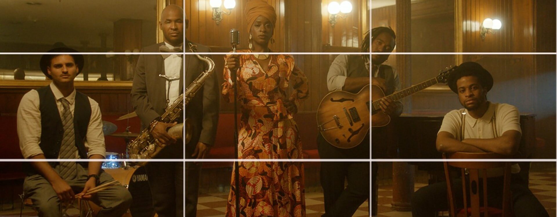
The Rule of Thirds works because it aligns with how the human eye naturally scans an image. When we look at a scene, our eyes don’t just settle in the center; they move around, seeking out points of interest. By positioning elements along the lines or at the intersections, the composition becomes more engaging and dynamic. This technique avoids the monotony that often comes with centered compositions, which can feel static and less interesting.
Placing the Subject: When framing a shot, positioning the subject off-center along one of the vertical lines can create a more dynamic and compelling composition. This technique is particularly effective in dialogue scenes, where the characters are placed on one side of the frame, leaving the other side open. This open space can be used to show what the character is looking at or to create a sense of balance.
Creating Balance: The Rule of Thirds helps to distribute visual weight across the frame. By placing important elements along the grid lines, you can create a sense of balance even when the composition is asymmetrical.
Enhancing Movement: The Rule of Thirds can be particularly effective in action scenes or when there is movement within the frame. Placing the subject off-center can create a sense of motion and direction, guiding the viewer’s eye across the frame.
Foreground and Background Elements: The Rule of Thirds isn’t just about placing the main subject; it’s also useful for positioning secondary elements within the frame. Placing foreground and background elements along the grid lines can create depth and layers within the composition, making the shot more visually complex and interesting.
While the Rule of Thirds is a powerful tool, it’s important to remember that it’s a guideline, not a hard-and-fast rule. Many great cinematographers intentionally break the Rule of Thirds to achieve a specific effect or to create a unique visual style.
Centered Framing: Centering the subject can create a sense of stability, power, or confrontation. This technique is often used in scenes where the filmmaker wants to draw immediate attention to the subject without any distractions.
Off-Balance Framing: Deliberately placing elements off-balance or breaking the Rule of Thirds can create tension, unease, or draw attention to the unusual composition.
Leading lines are one of the most powerful tools in a cinematographer’s toolkit. These are visual pathways within a frame that guide the viewer’s eye toward a particular point of interest, often leading them directly to the focal subject of the scene. Leading lines can be anything from roads, rivers, and fences to architectural elements like hallways, staircases, or even shadows.
Example: In Denis Villeneuve’s Dune (2021), cinematographer Greig Fraser uses leading lines extensively, particularly in scenes set in the vast deserts of Arrakis. The endless dunes, coupled with the lines created by the movement of sand, guide the viewer’s eye toward characters or objects, emphasizing their journey and the overwhelming scale of the environment.
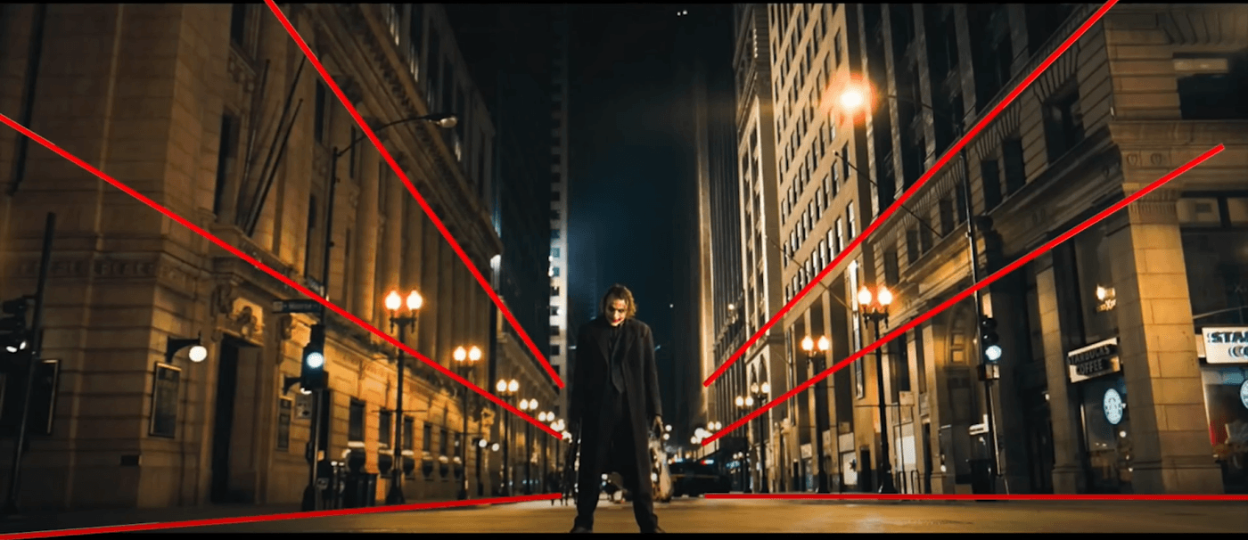
Leading lines are crucial because they help structure the composition, making it more dynamic and engaging. They can:
Leading lines come in many forms and can be used creatively to achieve various effects in cinematography. Here are some of the most common types:
Horizontal Lines: Often found in landscapes, roads, or horizons, horizontal lines tend to create a sense of calm, stability, and tranquility. They can guide the viewer’s eye across the width of the frame, often leading to a subject placed off-center.
Vertical Lines: Vertical lines, such as trees, buildings, or pillars, convey strength, power, and grandeur. They can draw the viewer’s eye upward, creating a sense of height or emphasizing the importance of the subject.
Diagonal Lines: Diagonal lines add dynamism and energy to a composition. They can create a sense of movement, tension, or instability, often guiding the viewer’s eye toward the focal point of the scene with a sense of urgency.
Converging Lines: When two or more lines converge toward a single point, they create a powerful focal point within the frame. This technique can be used to draw the viewer’s attention to a specific subject or to create a sense of depth and perspective.
Curved Lines: Curved lines, such as winding roads, rivers, or pathways, create a sense of flow and movement. They can guide the viewer’s eye in a more relaxed and natural way, often leading to a destination within the frame.
Leading lines are not just about visual aesthetics; they are integral to storytelling. By directing the viewer’s attention, they help convey the narrative in a more impactful way. For example:
Emphasizing Isolation or Danger: Leading lines that draw the viewer’s eye toward a small, isolated figure in the distance can emphasize the character’s loneliness or vulnerability, heightening the emotional tension of the scene.
Creating Anticipation: Leading lines can be used to build suspense by leading the viewer’s eye toward something just out of sight, creating a sense of anticipation or dread.
Enhancing Character Dynamics: Leading lines can also be used to highlight the relationship between characters, drawing the viewer’s eye from one character to another, thereby enhancing the interaction between them.
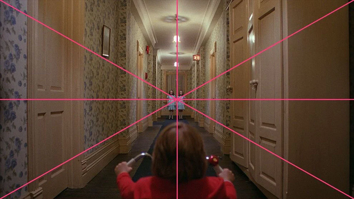
While traditional leading lines like roads, railways, or rivers are common, cinematographers often find creative ways to incorporate leading lines into their compositions:
Shadows and Light: The interplay of shadows and light can create leading lines that add depth and mood to a scene. Shadows can subtly guide the viewer’s eye, creating a more nuanced composition.
Reflections: Reflections in water, mirrors, or glass can create unexpected leading lines that add complexity to the composition, often leading the viewer’s eye toward something beyond the immediate frame.
Architectural Elements: The architecture of a location can provide natural leading lines that add structure to the composition. The lines of buildings, staircases, or arches can guide the viewer’s eye through the scene.
Leading lines are a powerful tool in cinematography, offering a way to guide the viewer’s eye, create depth, and enhance the storytelling. By understanding how to use leading lines effectively, you can create compositions that are not only visually striking but also deeply resonant with the narrative. Whether you’re framing a wide landscape, an intimate character moment, or a dynamic action scene, leading lines can help you tell your story in a way that captivates and engages your audience. Like all techniques in cinematography, the key is to use leading lines with intention, always keeping in mind how they serve the story and the emotions you want to convey.
Depth of field (DoF) is a critical aspect of cinematography that significantly influences framing. It refers to the range of distance within a shot that appears acceptably sharp and in focus. By controlling the depth of field, cinematographers can direct the viewer’s attention, enhance the mood of a scene, and add layers of meaning to the visual narrative.
Depth of field is determined by three primary factors: the aperture of the lens, the focal length, and the distance between the camera and the subject.
Shallow Depth of Field: A shallow depth of field means that only a small portion of the image is in focus, with the foreground and background appearing blurred. This technique is often used to isolate the subject from the background, drawing the viewer’s attention to specific details or characters.
Deep Depth of Field: A deep depth of field means that a larger portion of the image, from the foreground to the background, is in focus. This technique is often used in scenes where it’s important to keep multiple elements within the frame sharp and clear, allowing the viewer to engage with the entire scene.
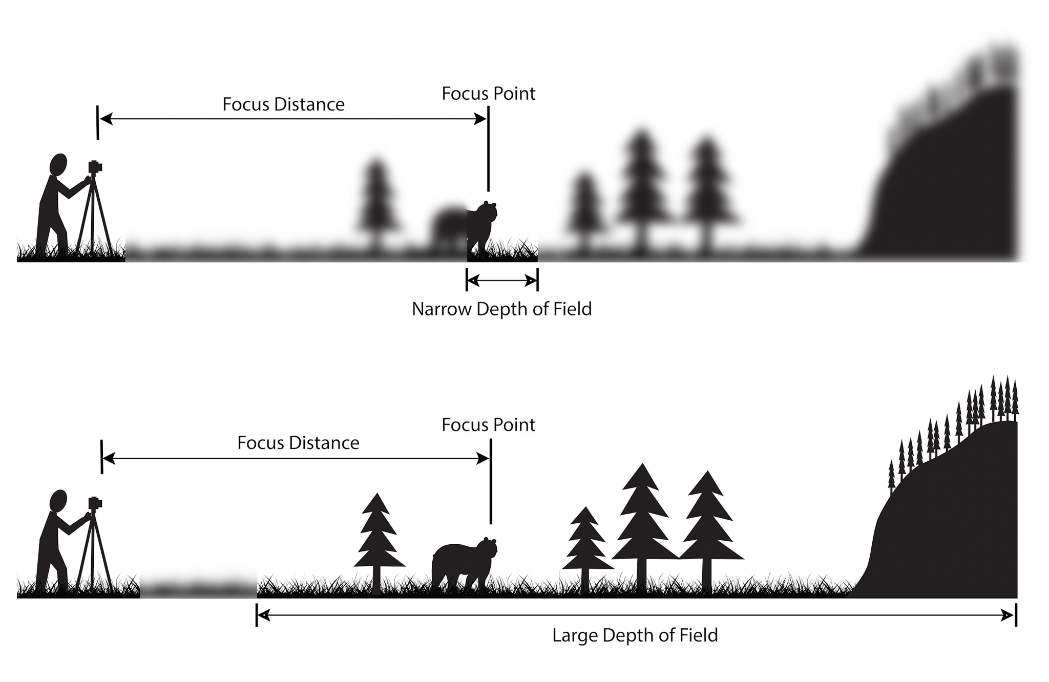
Credit: Photography Life
Directing Focus: By manipulating depth of field, cinematographers can guide the viewer’s attention to specific elements within the frame. In a scene with a shallow depth of field, the subject in focus becomes the clear focal point, while the blurred background helps to eliminate distractions.
Creating Visual Hierarchy: Depth of field can establish a visual hierarchy within a frame, highlighting what’s most important in the scene. By keeping certain elements in sharp focus while blurring others, cinematographers can subtly emphasize the narrative’s key aspects.
Adding Depth to the Composition: A deep depth of field can be used to create a sense of space and scale, making the composition feel more three-dimensional. This is particularly effective in wide shots or scenes where the environment plays a crucial role in the storytelling.
Enhancing Emotional Impact: Depth of field can also be used to convey emotions and psychological states. A shallow depth of field, for instance, can create a sense of intimacy or focus, while a deep depth of field can suggest openness, loneliness, or isolation.
Example: In The Assassination of Jesse James by the Coward Robert Ford (2007), Roger Deakins uses a shallow depth of field to create a dreamlike, introspective atmosphere, particularly in scenes where characters are lost in thought or reflecting on their actions. The blurred surroundings emphasize the characters’ emotional isolation.
While depth of field is often used to enhance focus and clarity, it can also be employed creatively to achieve unique visual effects:
Rack Focus: Rack focus is a technique where the focus shifts from one subject to another within the same shot, changing the depth of field dynamically. This technique is often used to shift the viewer’s attention from one part of the frame to another, revealing new information or changing the emotional focus of the scene.
Selective Focus: Selective focus involves deliberately keeping only a small part of the frame in sharp focus, often to create a sense of mystery or emphasize a particular detail. This technique can be used to draw attention to a specific element while leaving the rest of the scene ambiguous or out of focus.
Shifting Depth of Field: Cinematographers can also play with varying depths of field within a scene, moving from shallow to deep focus (or vice versa) to reflect changes in perspective, mood, or narrative focus.
Framing in cinematography goes beyond what’s within the camera’s view; it involves how the elements in the frame interact with the world outside it. Open and closed frames are two distinct approaches used to convey different storytelling dynamics.
Open frames suggest that the film’s world extends beyond the visible screen. This technique creates a sense of realism and immersion, making the scene feel like part of a larger environment.
Key Features of Open Frames:
Example: In Children of Men (2006), Emmanuel Lubezki uses open frames during chaotic scenes, with characters moving in and out of the frame. This technique immerses the viewer, making the action feel part of a larger, continuous world.
Closed frames contain all necessary information within the boundaries of the shot, offering a self-contained, controlled composition. This approach creates a sense of finality and focuses the viewer’s attention entirely within the frame.
Key Features of Closed Frames:
Example: In The Grand Budapest Hotel (2014), Robert Yeoman’s use of closed frames with precise, symmetrical compositions creates a visually rich, controlled world, reinforcing the film’s quirky, stylized atmosphere.
The choice between open and closed frames depends on the narrative and emotional impact desired:
Understanding and applying these framing techniques allows cinematographers to guide the viewer’s experience, whether by immersing them in a realistic world or focusing their attention on a meticulously crafted composition.
Symmetry and balance are crucial elements in cinematography that contribute to the visual appeal and emotional impact of a scene. By carefully arranging elements within the frame, cinematographers can create a sense of harmony, order, or even discomfort, depending on the narrative needs.
Symmetry involves mirroring elements on either side of a central axis, creating a balanced and harmonious composition. Symmetrical framing is often used to evoke feelings of stability, order, and beauty. It can also highlight the importance or centrality of a character or object within the narrative.
Visual Impact: Symmetrical compositions are visually striking and can immediately draw the viewer’s attention. The balance created by symmetry can make a scene feel pleasing and well-composed, reinforcing the idea of control or perfection.
Symbolism: Symmetry can also be used symbolically. For instance, perfectly symmetrical shots can suggest order and predictability, while slight imperfections in symmetry can create a sense of unease or tension.
Character Focus: Placing a character at the center of a symmetrical frame often emphasizes their importance or dominance in the scene. It can also create a sense of isolation, as the character is surrounded by the balance of the environment, highlighting their position in the narrative.
Example: Wes Anderson is renowned for his use of symmetry in films like The Grand Budapest Hotel (2014) and Moonrise Kingdom (2012). His symmetrical framing not only creates a distinct visual style but also reinforces the whimsical, controlled worlds his characters inhabit. The use of symmetry in these films contributes to the storytelling by establishing a sense of order and precision in the environments.
Balance in framing involves distributing visual weight across the frame to create a sense of equilibrium. Unlike symmetry, which is often exact and mirrored, balance can be more fluid, involving the careful arrangement of elements of varying sizes, colors, or positions to achieve a harmonious composition.
Visual Weight: Balance is achieved by considering the visual weight of objects within the frame. Larger, brighter, or more colorful objects may carry more visual weight, so they might be balanced by multiple smaller elements or by placing them strategically within the frame.
Asymmetrical Balance: Asymmetrical balance is when elements on either side of the frame are not identical but still create a sense of stability. This type of balance is often used to create dynamic and interesting compositions that feel natural yet intentional.
Emotional Tone: The balance in a frame can influence the emotional tone of a scene. A well-balanced frame can feel calm and reassuring, while an unbalanced frame can create tension or discomfort, reflecting the narrative’s mood.
Example: In Blade Runner 2049 (2017), Roger Deakins uses balance in his compositions to create a sense of equilibrium within the dystopian world. The visual weight of large architectural structures is often balanced by the placement of characters or light sources, creating a harmonious yet haunting atmosphere that reflects the film’s themes of order amidst chaos.
Aspect ratio is the relationship between the width and height of the frame, and it plays a significant role in how a film’s visual content is perceived. Different aspect ratios can dramatically alter the framing of a shot, influencing how the audience experiences the story.
4:3 (1.33:1): This nearly square aspect ratio was common in early cinema and television. It allows for a more intimate, focused composition, often used to center characters and create a claustrophobic or nostalgic atmosphere.
16:9 (1.78:1): Widely used in modern television and online content, this aspect ratio offers a balance between width and height, making it versatile for various types of shots. It’s often used for widescreen films and is standard for HDTV.
2.35:1 / 2.39:1 (Cinemascope): This ultra-wide aspect ratio is frequently used in epic films to capture expansive landscapes and large-scale scenes. The width allows for panoramic shots that immerse the viewer in the film’s environment, making it ideal for action, sci-fi, and fantasy genres.
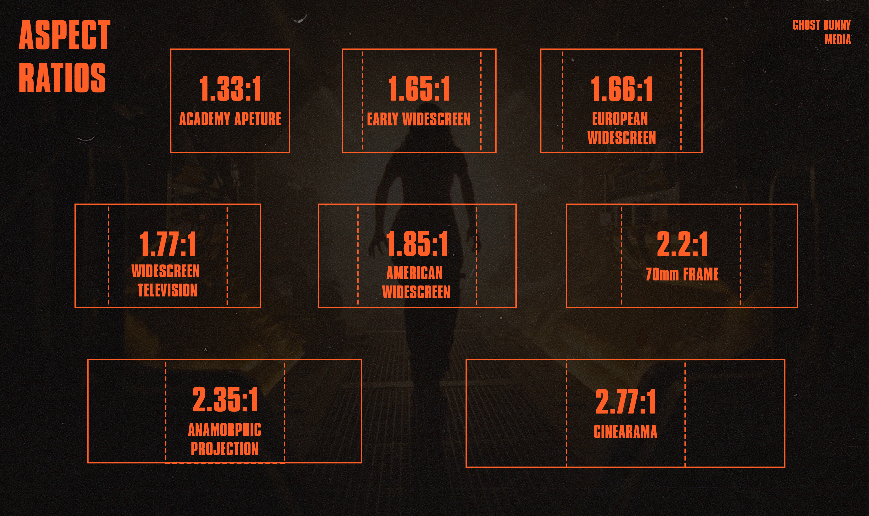
Composition: The aspect ratio directly impacts how a scene is composed. A wider aspect ratio like 2.35:1 provides more horizontal space, which can be used to show expansive settings or multiple characters within the same frame. In contrast, a narrower aspect ratio like 4:3 focuses the viewer’s attention vertically, making it suitable for close-ups or intimate scenes.
Storytelling: Aspect ratios can influence the storytelling by shaping how the audience perceives the space within the frame. For instance, a wide aspect ratio can make a character seem small and isolated in a vast environment, emphasizing themes of loneliness or insignificance. Conversely, a taller aspect ratio can make scenes feel more contained and personal.
Artistic Choices: Filmmakers often choose aspect ratios to evoke certain emotions or stylistic effects. For example, using a 4:3 aspect ratio can give a film a retro or timeless feel, while a wider aspect ratio can create a more modern, cinematic experience.
Example: In The Lighthouse (2019), director Robert Eggers and cinematographer Jarin Blaschke chose a 1.19:1 aspect ratio, a narrow and almost square format, to create a sense of confinement and claustrophobia. The aspect ratio enhances the film’s eerie, oppressive atmosphere, making the viewer feel as trapped as the characters within the isolated lighthouse setting.
Example 2: In Lawrence of Arabia (1962), Freddie Young used the Cinemascope 2.35:1 aspect ratio to capture the vast deserts of the Middle East. The wide format allowed for sweeping panoramic shots that emphasized the epic scale of the landscape, reinforcing the film’s themes of grandeur and exploration.
We hope this article has given you a good starting point for understanding the basics of framing in cinematography. From the Rule of Thirds to leading lines and depth of field, we’ve touched on quite a few key concepts that are essential for crafting powerful visuals. By looking at the work of legendary cinematographers and iconic films like Blade Runner, Dune, and Alien, you can understand how these filmmakers apply these techniques and rules in their own films.
However, theory can only take you so far. The best way to understand and hone in these skills and techniques is by applying them in your own projects. Go out, shoot your own scenes, and see how changing even one element can completely transform a shot. With practice, you’ll develop a natural feel for framing, allowing you to create visuals that tell your story in the most compelling way. Thanks for taking the time to read our blog and we hope we’ve helped you discover more tools for your filmmaking arsenal!
Alex Woods
Sep 17, 2024
Framing, Cinematography, Bladerunner, Dune, Alien,